Branding is one of the most important things you can do for your business. And whether you’re doing branding for yourself or if you’re a graphic designer creating branding for a client, there are some important steps that you need to consider before you even pick up a pencil and make that first logo sketch.
I’m Ash Francis; I’ve been working in web and online marketing for over 15 years and developed several brands along the way, and here are the things I’ve learned over the years.
Don’t sketch right away. It can be really tempting to pick up your pencil and start designing logos straight out of the gate, but every time I’ve done this, I’ve found myself pushed down a path where I form the brand around the logo rather than the other way round. Remember, the logo signifies the brand, not the other way around.
Outline who you are and what you represent early on. What is “it” about? Where does it position itself in the market? How should people feel when they see this or hear it mentioned? That’s what your brand is. Do the cheesy corporate thing and come up with your keywords and buzzwords, maybe a core of 3 to 5, with some satellite words around that if you can. That’s the foundation of your brand and everything needs to be built upon this.
Colours are important. What are your colours looking like? There’s a lot of information out there on colour theory, colour psychology, contrast and visibility; build a solid colour palette (as well as white and black replacements)
Establish your type. Getting your font right is important; it’s going to follow the brand everywhere. Makes sure the body font is a legible one so you’re not chopping and changing trying to meet web guidelines for your site. Get it right early and save yourself the headache down the line.
Now you can draw. Now you’ve got everything in place, you can start designing! Remember when you design your logo, you’re designing for everywhere it can show up, not just on a white background! Remember to design for dark, black and white and even on products and billboards. There are plenty of mockups for that if you need help picturing how it’s going to look.
I’ve created a free document that can help you with your brand design process, linked here, or if you want to hire a professional, contact me and let’s get your brand design underway!
When looking for a web developer for your project, it can be a real minefield. You know what you need, but you need to choose someone to deliver it. How do you go about choosing the right developer? Do you choose a freelance developer or an agency? These tips will help you make an informed decision.
Understand Your Project Needs
It’s important not only to know what you’d like your website to look like, but also what it needs to do for you and your audience. You might already be aware of this, but whether you are or not, your developer of choice should also be able to talk you through this as well. Even if they’re primarily a WordPress developer, they should still be able to talk you through the differences between platforms and technologies for a standard brochure site and understand the pros and cons between WooCommerce and Shopify for your ecommerce project.
Freelance Developer or Agency
Do you choose a freelance developer for your project or go with an agency instead? Now, of course, I’m going to be biased and suggest a freelancer, but there are benefits to both. An agency has the benefit of a large team of employees of all disciplines and the ability to deliver more work more quickly due to resources.
However, a freelance web developer will usually have the same capabilities as the senior developers at any agency, and whilst they may not have as many people on hand as an agency, they’ll also have lower overheads and therefore much lower costs for your project. Any good freelancer will also have a network of professionals that they collaborate with in order to deliver the right cocktail of skills for your project’s needs.
Previous Work
It’s always worth having a look at what work they’ve done before when deciding on a developer for your project. Even if they haven’t worked with your particular business or project type before, their portfolio should have something that shows the standard of their approach, ability to solve problems and deliver solutions in line with your needs.
Delivery Time
The delivery time of your project is important, and it’s important when choosing your web developer that they’re able to deliver your project within the chosen window and that they’re also given enough lead time to deliver that project. A developer should be able to give you a date range for delivering the project as well as explaining factors that may lengthen or shorten the project delivery.
Pricing
The price is always going to be a factor in any business decision, and it’s worth checking to see if your chosen developer can work within your budget. The cheapest option isn’t always the best so it’s always worth asking the right questions to see what you’re getting for your money, and whilst agencies will almost always be more expensive than a freelance developer due to their own costs and offerings, sometimes a cheaper freelancer may still be able to offer you everything you want within the scope of your project, whilst still providing the quality you need.
Need a Freelance Web Developer?
I’m a freelance developer based in Birmingham and ready and willing to take on all kinds of projects in the West Midlands and the UK as a whole. Let’s connect today!
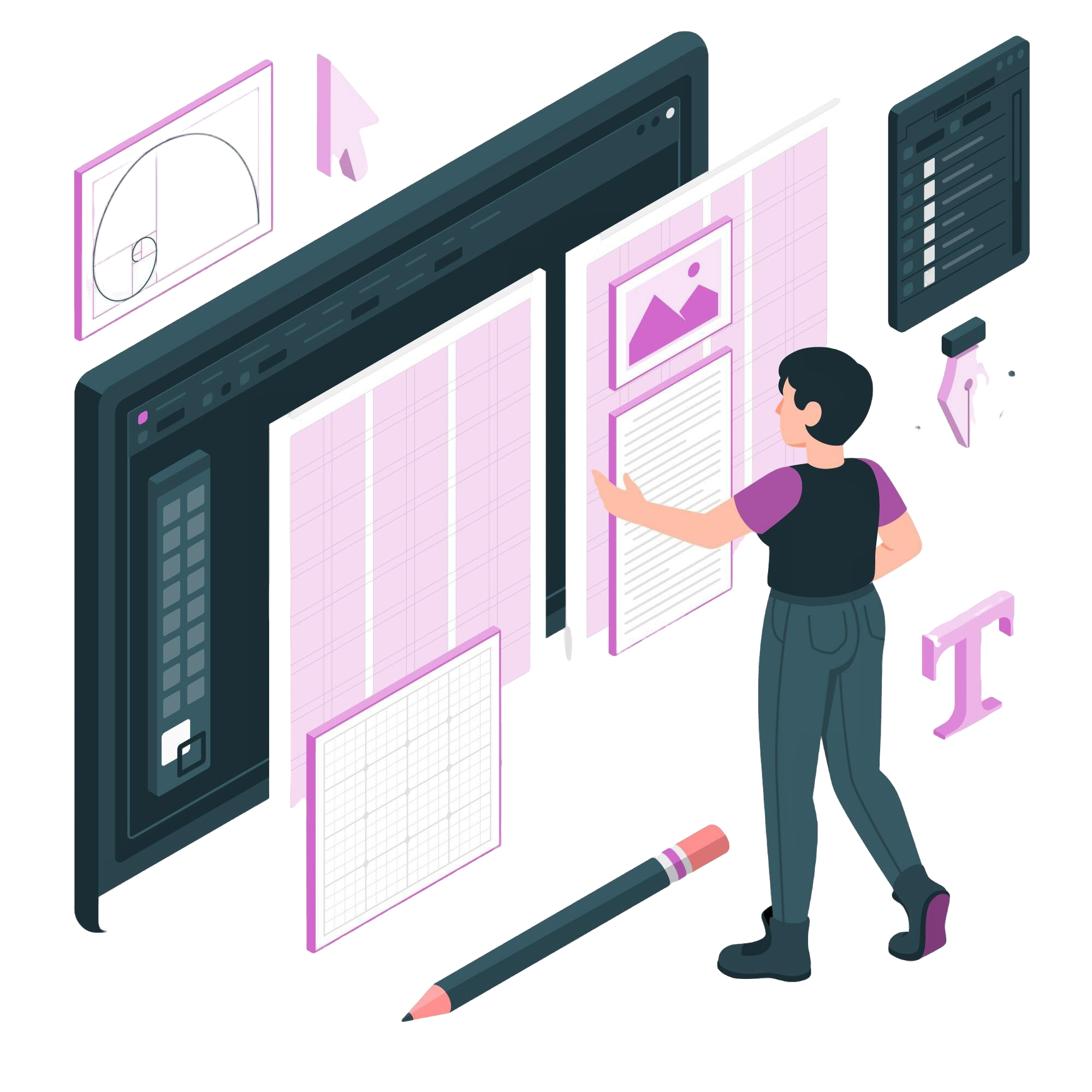
When designing websites is your life, you’ll often find things that are really useful and powerful in getting an approval from the client, but also creating a great experience for the site’s users. So in this post, I’m going to share a few of my favourite tricks and elements to use when I’m designing a website.
Large Images
Humans are visual creatures and websites are primarily a visual experience. A lot of the time, the structure and functionality of the site sadly goes under the radar or is an afterthought, because, especially at the design stage, the imagery can often be the deciding factor.
Big images are one of my favourite web design tropes, simply for the amount of impact they can have on a design. And as attention spans decrease due to internet behaviour trends, breaking up a wall of text with a nice large image is an easy win.
(image: SIGA Slate)
Full-screen experiences
I love creating full screen experiences with websites and web applications, for two reasons:
Simply, I think they look fantastic.
They create immersion.
With nothing else on the screen, there’s nothing distracting or overwhelming, nothing forcing the user to go to the next area. The user feels in control of what’s on screen, what they’re consuming and the rate at which they consume it.
It’s a very subconscious tool, but one that makes a lot of sense when you delve into behavioural patterns of users.
(image: Rotary GBI)
Large spacing
Large amounts of padding and spacing helps to compartmentalise content into easy-to-digest blocks, making it easier – and more pleasant – to read.
The human eye wanders multiple times per second, so taking the effort out of focusing by spacing things out makes things easier on the user, keeping them on the site longer and converting them into repeating visitors.
Also, there’s something aesthetically pleasing about keeping content away from the edge of the screen or container that makes it feel a bit more safe and secure. Maybe that’s just me, but I love designing things that way.
(image: Front of House International)
So, there’s three nice and simple web design tricks that create a lot of impact in your designs and end product. I’ll likely do more posts like this, so be sure to check back for more!
Like the way I do things?
I’d love to build visually striking and powerful web experiences for you – get in touch and let’s get things moving!
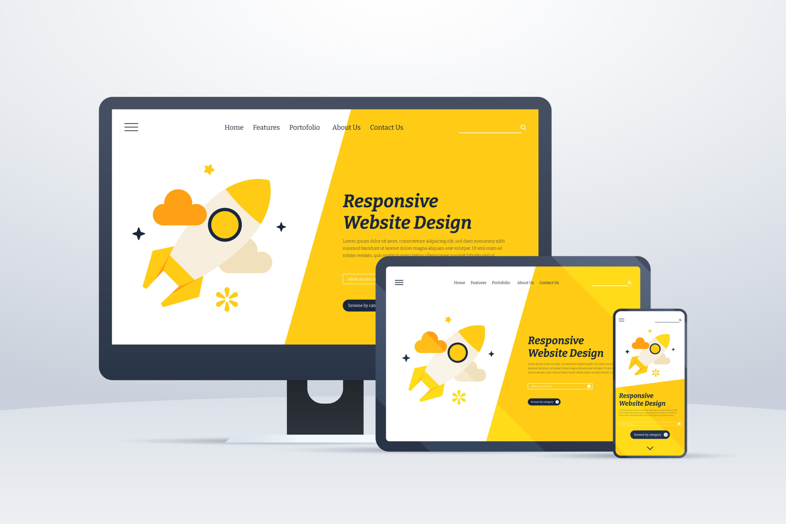
When I’m building websites, the most important thing I have to factor in is accessibility. I’ve written about this before, but there are a lot of things that come under that umbrella, but the most wide-reaching aspect of this is device accessibility, often referred to as “responsiveness”.
What is “responsiveness”?
Put simply, a responsive website is one that allows its functionality to adjust and work on various devices within the same level of ease. This is typically shown by having sites collapse gracefully on smaller screens so that all of the content is still visible on narrower devices, but can be a bit more detailed, such as changing carousel navigation from buttons to draggable elements on touch enabled devices.
This means that when you view a site on your desktop and then leave the house and want to carry on looking at it on your mobile phone during your morning commute, you’re not edged out of the experience because of the device.
How do you make sure your web design is responsive?
The concept of responsive web design has been a mainstream school of thought for a long time, but that doesn’t mean that a website is guaranteed to be responsive when you build it. And even when you do build it, you’re not going to have every single device available to test on to see that it’s all working as expected. But there are a few ways that I like to ensure a responsive experience when I build out sites.
CSS Libraries
The vast deal of responsiveness comes down to CSS, this is how you change the way your site looks and it can be written in a way that checks for the width of the device and makes the necessary adjustments. The problem with this is that writing it out from scratch takes a LONG TIME and is for the most part unnecessary when it’s been done before. CSS Libraries such as Bootstrap, Bulma, Tailwind and Skeleton are my favourites depending on the project. They’re built with lots of components to build your site on, but the most useful thing about them is that they have responsive breakpoint classes built in than make life easier and allow the builds to be more consistent.
Device Emulators
Remember earlier when I said that you don’t always get the chance to test on every single device out there, so it’s hard to know what’s going to work? Well, I now use device emulators to load a website in multiple different views at the same time in order to test the experience seamlessly and, more importantly, before it goes live.
The reason device emulators, and specifically the right ones are important are because some simply mimic the size of the screen, but not all of them emulate the operating system. I learned this the hard way when I was building a site and testing in Firefox and Chrome across breakpoints but then secondary testers were reporting a different experience on their Safari browsers, because Safari doesn’t process CSS preprocessors the way other browsers do. This caused days of frustration but was a teachable moment that’ll thankfully never happen again.
Why is this important?
It means that I can be certain in the end product I deliver to clients, but also the speed in which I deliver them, maintain and upgrade things is drastically improved too. And ultimately, it means that the client can have more faith in their product, safe in the knowledge that their audience can access their content wherever they are.
Are you in need of a new responsive website?
Take a look at the web design packages available, safe in the knowledge that they’re all responsive and look the part on all modern devices.
Wasting time is costing you money. It’s time to stop.
Managing your workflow is one of the most important parts of being successful, whether as a freelancer, an employee or business owner.
It sounds simple, but using the right tools for the job will completely streamline your workflow and make your life so much easier. So where are you going wrong?
What’s the Word?
The biggest success of Microsoft Word is that it’s accessible, and most people will have learned to use it at its basic level at some point in the past. The danger with that level of familiarity is that people think it can do pretty much anything – and at a surface level, they’re not wrong. It can create almost any kind of everyday office document you could wish for; but it doesn’t mean they’ll be good.
Here’s the kicker – if it’s not a word document, don’t use word.
This entire article was actually inspired by someone bringing me a rota in a word document and asking me to improve on it. So, we’ll actually dig into this example and the thought process behind streamlining your workflow.
What’s going on here?
The first thing to ask yourself when looking for an internal solution is simply: “What needs to happen?”
Using the rota example, the answer to that is: It needs to display information based on dates and times.
That is quite simply the function of a calendar. Nothing more or less than that. Show the dates, show information regarding those dates (eg. whose shift it is, training dates etc). So why was this done in a word document?
The answer is simple: familiarity. And that’s not anyone’s fault, but that’s the issue at hand.
I’ve seen Word Processors being used to create menus, posters, and even to write code, all because it has rudimentary tools to emulate what you want to deliver. It’s an unfortunate swiss army knife – incredibly useful in a pinch, but just like a swiss army knife, unable to do most things with any real quality.
The same goes with other tools like Excel. It suffers a similar issue to Word – this thing uses numbers or this thing would look good in a grid, I’ll use Excel for it. And again, you’ll get some joy at a basic level, but the truth of the matter is, there’s a better tool for it.
I’ve been guilty of it in the past, particularly using Excel for things it didn’t necessary need to be used for because of how well it handles data, despite not actually being a database tool (now, granted, most people have no business being anywhere near an actual database) but as someone who knows better, I should definitely encourage and empower people to do better where I can.
Now, for my workflow, I use Notion (this isn’t sponsored or affiliated in any way, I just find it to be insanely useful) because I can utilise the same information in the way it needs to show up. But it doesn’t even have to be a premium tool to get you there. Most workspaces will have the tool you need for a workflow solution.
Lets get back the the rota example. I was sat in my office about to start building out something in excel and then it came to me. I read the brief again and asked the client – you all use Outlook, right?
“Yes, why?”
“Outlook has a calendar, and everything you want can be done on that calendar.”
I could have sold them on a specially custom built excel spreadsheet option with auto formatting and all these bells and whistles, but why do that when I can actually empower them to have the right solution that’ll serve them better in the long run.
That’s what comes with being able to identify the solution rather than focusing on the issue.
Utilising the right tools at your disposal will make things so much easier than you think. And it doesn’t have to cost you anything.
What Should I Use?
Over the years I’ve build up a fair bit of experience advising people on the best digital solutions for different issues.
Necessity
Common Tool
Correct Tool
Rota/Schedule
Excel/Word
Calendar App (Outlook/Google)
Password/Login list
Excel/Word/Notepad
Password Manager (LastPass)
Task Tracking/Project Management
Excel
Notion/monday
A specific Calendar Tool like Google Calendar is designed to handle date/time data, events and chronology. Excel and word can generate tables, and excel specifically can handle process numerical data, but isn’t designed to create events within dates in a way that makes sense in human-computer interface.
A password manager, like LastPass, for example allows for seamless password syncing across accounts and devices, as well as improving security.
Task Tracking tools like Notion and monday have interfaces that are specifically geared towards managing tasks, assigning them to users, handling progress, time tracking and more. Excel doesn’t have this built in, and whilst you can create a semi-decent copy, it’s not anything close to the real deal.
Need help streamlining your processes?
Efficiency shouldn’t be expensive, and I specialise in finding the right tools for the job, saving you time and money in the process. Feel free to get in touch and let’s work on your solution.
WordPress is the most popular tool for building websites and is definitely my favourite. But recently, I’ve been leaning into building old school static websites again. But what are the benefits of going back to static vs WordPress?
Development
Developing websites in WordPress is designed around scalability, content addition and on-the-fly modification. However, the flip side of this is that all of the customisation can take a lot of development time early on, in order to save time over the lifetime of the website.
In a static website, the development is based around the specifics of the site as it is, without much regard for what it will become as it changes, because, as the name suggests, it’s not intended to change much. So, with that in mind, the development is quicker with a view to creating a specific end product. Most sites don’t actually change their core content very often, if at all, so the extra development cost can be somewhat wasteful, especially if the site isn’t going to contain a blog.
Maintenance
Even on the most basic website, you’ll need to run maintenance on it to ensure it’s secure, running as expected and technologically up to date. On WordPress, this is a regular occurrence, as the nature of WordPress sites means that you’ll have a lot of different technology present on a site at once, usually in the form of plugins. These will need updating and testing to check for conflicts whilst also being aware of security vulnerabilities.
To say none of this is the case with a static site would be untrue, however, there’s a lot more control and far less to worry about in that regard. However, WordPress does allow for quicker and cleaner updates and improvements to a site whereas doing it manually on a static site leaves a lot of room for error.
Content Management
It should come as no surprise that the world’s number one content management system is pretty good at content management. Adding images, videos and files to WordPress is incredibly easy, they get added to an appropriate file system and they’re incredibly easy to access and reference both for developers and casual users, which makes it a popular choice long-term for people who want to have a site built and then manage it themselves, rather than relying on a developer to make all the changes.
A static site, however, requires a knowledge of file structure, FTP and at the very least, some decent HTML knowledge. You get a little bit more in terms of control, but it’s definitely a point in favour of WordPress. Dynamic websites require a dynamic solution – that’s the long and short of it.
SEO
Getting your site to show up on Google is a key part of a website’s long term success. Now, there’s no specific benefit either way between WordPress or static, however, WordPress makes some of the on-site SEO quicker and easier with plugins that allow you to track the effectiveness of your optimisation.
It’s still perfectly fine to do SEO on a static website, despite it being easier on WordPress. There’s nothing stopping you from having all of the correct metadata, and of course, the majority of the SEO benefit is going to come from the value of the content, it’s just going to require a little more skill and knowledge.
Overall
There’s not much that separates the end product you’d get from a static site vs a dynamic WordPress site. It’s simply about knowing what the site is, what it needs to be long term and developing accordingly. If the site is going to need to scale and change frequently with a lot of functionality, or requires non-developers to make changes to content, then WordPress is definitely the way to go.
However, if you need a simple static site with information that isn’t likely to change or be added to on a regular basis, then a static site will be perfectly fine to work with.
I’m currently developing a piece of web technology that will hopefully save the lives of abuse victims using the internet. Whilst I can’t talk about it in-depth, for obvious reasons, the process has brought up a lot of philosophical questions and thoughts about the ethics of the technology we build, the data we have access to and who we serve when we build these tools.
Technology, by its very nature, is created in order to make things easier for us. From the earliest invention of the wheel to the space we find ourselves in with generative AI, the initial question we find ourselves asking is “How do I make this easier?”, but how often do we look and ask “How do we make things better?”?
It’s the word “better” that contains the root of the issue here. Are we simply making things “better” in terms of efficiency? Less time and effort, less man-hours therefore less cost. Is this where we aim when we shoot for better? Or do we seek an improvement in the human experience? I’ve written previously about how we can approach web and digital development in a way that includes disabled users, rather than factoring them in as an afterthought and this is further along that train of consciousness.
Can we create technology that seeks PRIMARILY to improve the human experience, literally change and perhaps even SAVE LIVES? Technology, even in its most basic form, has the ability and potential to do exactly that. And when we pour ourselves into that, and by extension, pour ourselves into the greater good, we can advance our fields, and push innovation, whilst all those commercial benefits that we all need in the world we live in are still there to be attained.
Technology doesn’t mean putting people on the backburner. It’s about bringing them to the forefront.
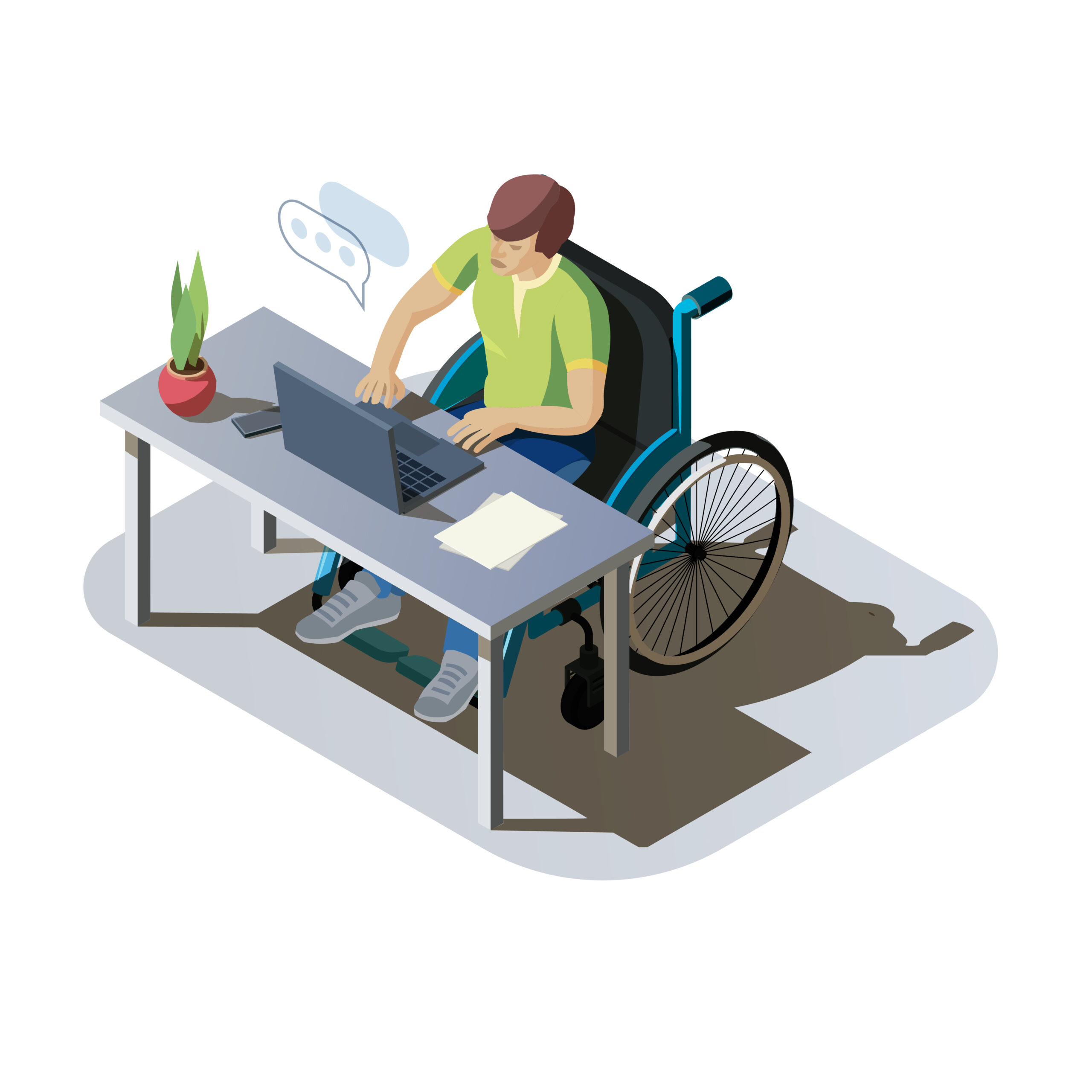
When using the web, we often engage in a shared consumption experience, be that information, provision or entertainment. But for many users, that shared experience isn’t equitable due to disability and society’s lack of consideration when it comes to disabled users.
Disability Stats
In 2020, the Office of National Statistics reported that, in the UK alone, almost 11 million disabled adults were active or recent internet users.
That equates to roughly 81% of disabled adults in the UK and 1/4 of the UK’s adult population.
That’s too large of a number to overlook, and yet, as a society and an industry, we still treat it as an afterthought. If ¼ of your audience were obstructed from engaging with your business, you’d change something fairly urgently, right? Well, it turns out, that’s already the case.
Disability Examples
When we think of disability, we typically think of the more obvious physical ailments that limit movement or severe learning difficulties that limit communication and social integration. And whilst these can affect how a user engages with the web, there are also less obvious ailments that have a similar impact.
Some common examples of these include:
Dyslexia
Colour-blindness
Partial and full blindness
Partial or full loss of fine motor function
Solutions
Creating solutions or designing visual products with these disabilities in mind may seem daunting or restrictive, however there are simple things that we can bake into our default thinking to make our workflow subconsciously disability friendly.
Colour
A very common accessibility issue is contrast. High contrast levels between backgrounds and text make things easy for both dyslexic and colour-blind users. However, the extreme contrast of pure white and pure black is actually a bad choice for ALL users. It puts a lot of strain on the eyes and also makes reading difficult for dyslexic users. Consider an off-white pale grey to replace white and a charcoal grey to replace black. In the grand scheme of things, it won’t affect the visual for the majority of users, but will make a difference to the overall viewing health of your audience. Also, consider a golden ratio of 5:1 contrast as a bare minimum.
Text
Sans-serif fonts are a lot easier for dyslexic people to read, with Arial, Comic Sans and Verdana standing out as common options. Fonts should also be a minimum of 16px for body text as a basic readability standard.
Code and navigation
Writing semantically-rich (read: correct-by-the-book) code is important for people who are unable to use a touchscreen or a mouse with the relative ease of your typical user. These members of your audience are likely to use third-party peripherals or keyboard-only navigation to path through your site and by writing code correctly, you can make it much easier for these users and their tools to parse your content effectively. Semantic-rich code is also essential for the correct functionality of screen readers. This means using the correct tags and elements, rather than just relying on styling to create layouts and experiences. Whilst a <section>, a <div> and an <aside> tag can all be used to separate content and can be functionally similar, for a screen reader, they’re different with specific purposes. In the same way, you could style H1-H6, body text and <code> text to all look exactly the same, but again, a screen reader treats each of them in the originally intended manner. Without the code being written correctly, this can present a sub-par experience for those of your consumers with poor eyesight.
Overarching Point
Web and digital products are key tools in connecting us, our products and our services with our clients and communities, and there are simple but important steps we can take to make sure that everyone can engage with us, not just those without disability.
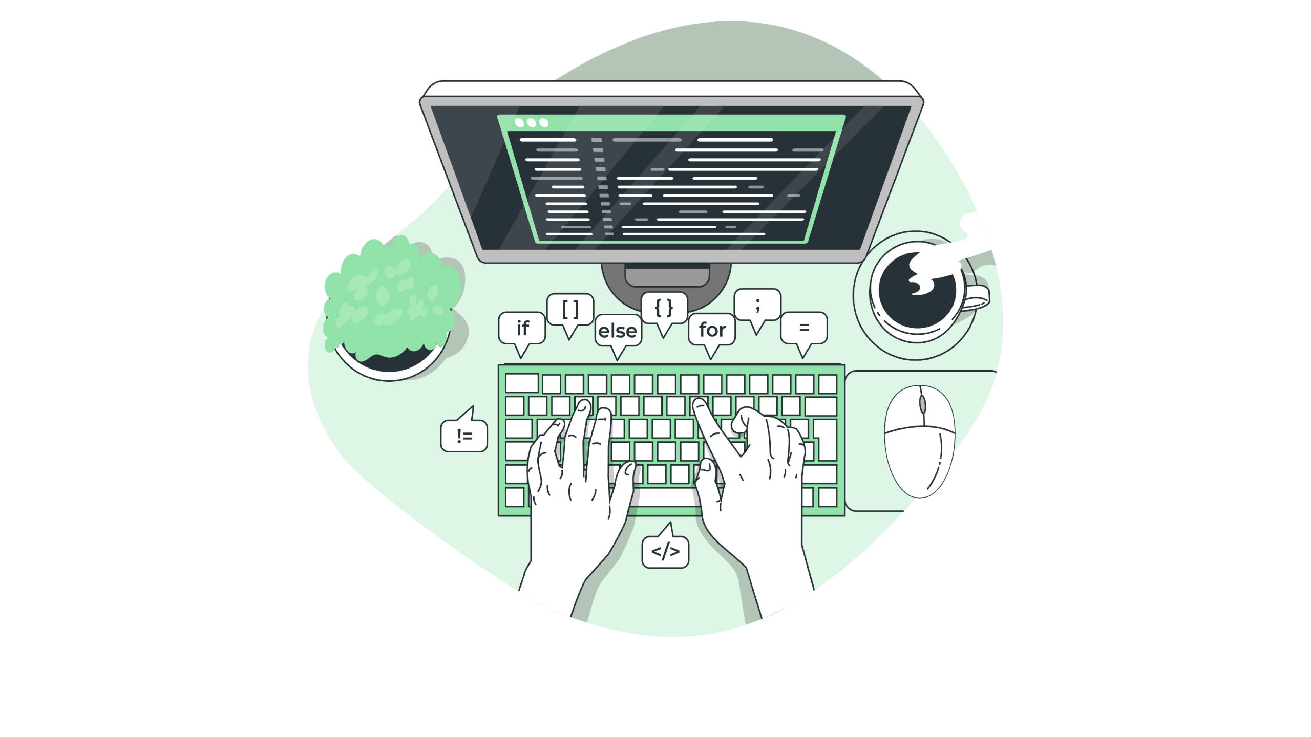
A slow website is one of the most frustrating things on the internet for users, site owners and search engines alike. For users, a slow site causes delay in a world where content is usually served in an instant. For search engines, a slow site is a marker of low quality, so search engines rarely push slow sites to the top of search rankings. And as a site owner, a slow site means that you’re making a poor impression on your visitors and most likely not getting the results you’d want from your site. So, how do we speed up your slow website, or stop it from being slow in the first place?
What is slowing down my website?
The key to speeding up a slow website is first understanding what make a website slow in the first place. Website speed, as most users will experience it, is the time it takes for the browser to display the necessary content. So, naturally, the more content on a page, the more time (in theory) it’ll take to load.
Web files (e.g .html, .css, .js) themselves are individually very small and don’t take much time to load in (although some of their actions and requests may take some time, but the main culprits on a slow site tend to be images, videos and other embedded elements.
How do I speed things up?
Of course, we don’t want you to build sites without images and videos, far from it. In fact, you can have all the visual content you like, simply by optimising it.
Images
With images, priming them for web is often simpler than people realise. A lot of images, especially photos, are naturally designed to look nice for print. These have far more detail than you’d ever be able to render on a screen, and as a result, the files are huge and take ages to load. However, you can use multiple online tools to reduce the pixel count to 72, lower the files size whilst keeping the image quality good enough for web.
Also, for things like icons, or vector based images, web browsers are perfectly capable of displaying vectors as SVGs, either as the data or the file. Either way, these files use mathematical data to generate the images, which is much quicker for a computer than loading and drawing an image, resulting in a faster web page.
Video
When it comes to video, hosting them on your server and rendering them raw is usually not a great idea. Video files are huge, even in compressed formats like .mp4, so it’s not advised for you to do that on a server that’s usually designed to handle basic web files. You’ll also use your bandwidth pretty quickly.
Instead, host your videos on YouTube or Vimeo and allow them to cleverly compress and deliver your content to your viewers with no strain on your site. Also, because it’s hosted elsewhere and you’re embedding it, rather than rendering it, it has no effect on the load time of your webpage.
Javascript
Javascript files, whilst small, are a series of instructions and actions for a website to carry out under different circumstances. Some of this needs to happen as the page is loading and can block the render of the rest of the page until it completes its task. Minifying your code and ensuring that your js functions are written in a way that minimises blocking is incredibly beneficial in speeding up your slow web page.
On top of that, only loading scripts where they need to be used is a great way to eliminate wasted resources.
Caching
Enabling caching means that the browser can save a website’s resources in its current state, meaning that repeat viewers of the website won’t have to load CSS or JS from scratch every single time until those resources change or a certain amount of time has passed.
In conclusion…
Your slow website isn’t a death sentence by any means and some simple changes can be implemented to speed it up.
Need Help?
If you need help with a slow website, I’m on hand and happy to help you with your issue, please don’t hesitate to get in touch!