When I’m building websites, the most important thing I have to factor in is accessibility. I’ve written about this before, but there are a lot of things that come under that umbrella, but the most wide-reaching aspect of this is device accessibility, often referred to as “responsiveness”.
What is “responsiveness”?
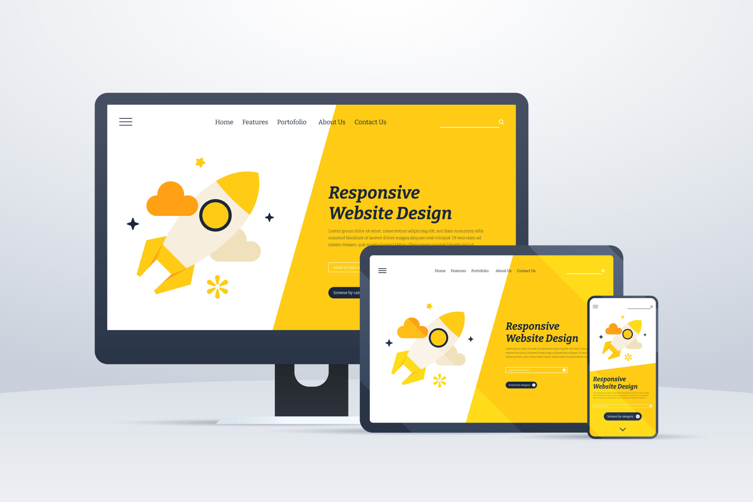
Put simply, a responsive website is one that allows its functionality to adjust and work on various devices within the same level of ease. This is typically shown by having sites collapse gracefully on smaller screens so that all of the content is still visible on narrower devices, but can be a bit more detailed, such as changing carousel navigation from buttons to draggable elements on touch enabled devices.
This means that when you view a site on your desktop and then leave the house and want to carry on looking at it on your mobile phone during your morning commute, you’re not edged out of the experience because of the device.
How do you make sure your web design is responsive?
The concept of responsive web design has been a mainstream school of thought for a long time, but that doesn’t mean that a website is guaranteed to be responsive when you build it. And even when you do build it, you’re not going to have every single device available to test on to see that it’s all working as expected. But there are a few ways that I like to ensure a responsive experience when I build out sites.
CSS Libraries
The vast deal of responsiveness comes down to CSS, this is how you change the way your site looks and it can be written in a way that checks for the width of the device and makes the necessary adjustments. The problem with this is that writing it out from scratch takes a LONG TIME and is for the most part unnecessary when it’s been done before. CSS Libraries such as Bootstrap, Bulma, Tailwind and Skeleton are my favourites depending on the project. They’re built with lots of components to build your site on, but the most useful thing about them is that they have responsive breakpoint classes built in than make life easier and allow the builds to be more consistent.
Device Emulators
Remember earlier when I said that you don’t always get the chance to test on every single device out there, so it’s hard to know what’s going to work? Well, I now use device emulators to load a website in multiple different views at the same time in order to test the experience seamlessly and, more importantly, before it goes live.
The reason device emulators, and specifically the right ones are important are because some simply mimic the size of the screen, but not all of them emulate the operating system. I learned this the hard way when I was building a site and testing in Firefox and Chrome across breakpoints but then secondary testers were reporting a different experience on their Safari browsers, because Safari doesn’t process CSS preprocessors the way other browsers do. This caused days of frustration but was a teachable moment that’ll thankfully never happen again.
Why is this important?
It means that I can be certain in the end product I deliver to clients, but also the speed in which I deliver them, maintain and upgrade things is drastically improved too. And ultimately, it means that the client can have more faith in their product, safe in the knowledge that their audience can access their content wherever they are.
Are you in need of a new responsive website?
Take a look at the web design packages available, safe in the knowledge that they’re all responsive and look the part on all modern devices.
Web Design Services