
When designing websites is your life, you’ll often find things that are really useful and powerful in getting an approval from the client, but also creating a great experience for the site’s users. So in this post, I’m going to share a few of my favourite tricks and elements to use when I’m designing a website.
Large Images
Humans are visual creatures and websites are primarily a visual experience. A lot of the time, the structure and functionality of the site sadly goes under the radar or is an afterthought, because, especially at the design stage, the imagery can often be the deciding factor.
Big images are one of my favourite web design tropes, simply for the amount of impact they can have on a design. And as attention spans decrease due to internet behaviour trends, breaking up a wall of text with a nice large image is an easy win.
(image: SIGA Slate)
Full-screen experiences
I love creating full screen experiences with websites and web applications, for two reasons:
- Simply, I think they look fantastic.
- They create immersion.
With nothing else on the screen, there’s nothing distracting or overwhelming, nothing forcing the user to go to the next area. The user feels in control of what’s on screen, what they’re consuming and the rate at which they consume it.
It’s a very subconscious tool, but one that makes a lot of sense when you delve into behavioural patterns of users.
(image: Rotary GBI)
Large spacing
Large amounts of padding and spacing helps to compartmentalise content into easy-to-digest blocks, making it easier – and more pleasant – to read.
The human eye wanders multiple times per second, so taking the effort out of focusing by spacing things out makes things easier on the user, keeping them on the site longer and converting them into repeating visitors.
Also, there’s something aesthetically pleasing about keeping content away from the edge of the screen or container that makes it feel a bit more safe and secure. Maybe that’s just me, but I love designing things that way.
(image: Front of House International)
So, there’s three nice and simple web design tricks that create a lot of impact in your designs and end product. I’ll likely do more posts like this, so be sure to check back for more!
Like the way I do things?
I’d love to build visually striking and powerful web experiences for you – get in touch and let’s get things moving!
Get in TouchHow I guarantee responsive website designs
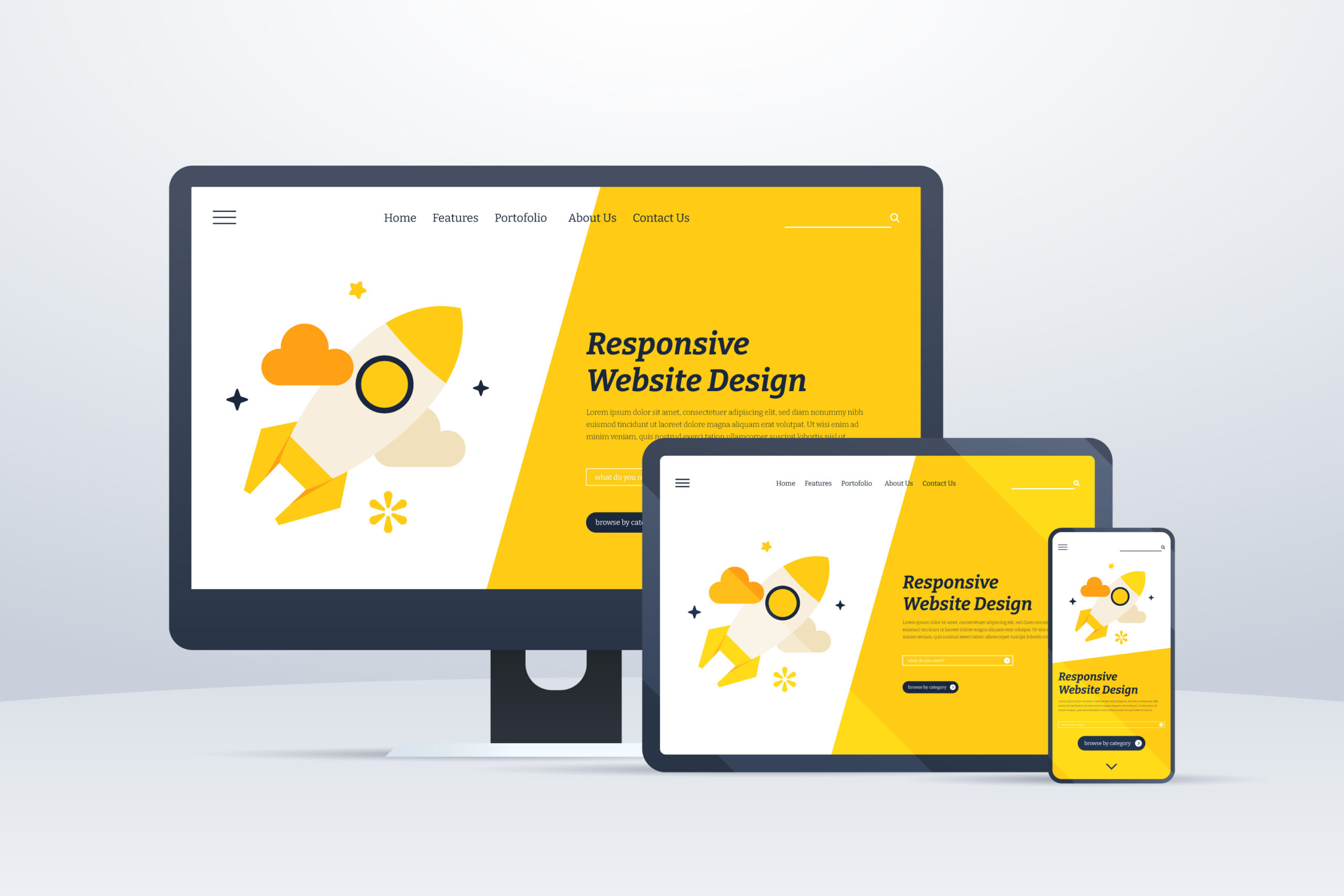
When I’m building websites, the most important thing I have to factor in is accessibility. I’ve written about this before, but there are a lot of things that come under that umbrella, but the most wide-reaching aspect of this is device accessibility, often referred to as “responsiveness”.
What is “responsiveness”?
Put simply, a responsive website is one that allows its functionality to adjust and work on various devices within the same level of ease. This is typically shown by having sites collapse gracefully on smaller screens so that all of the content is still visible on narrower devices, but can be a bit more detailed, such as changing carousel navigation from buttons to draggable elements on touch enabled devices.
This means that when you view a site on your desktop and then leave the house and want to carry on looking at it on your mobile phone during your morning commute, you’re not edged out of the experience because of the device.
How do you make sure your web design is responsive?
The concept of responsive web design has been a mainstream school of thought for a long time, but that doesn’t mean that a website is guaranteed to be responsive when you build it. And even when you do build it, you’re not going to have every single device available to test on to see that it’s all working as expected. But there are a few ways that I like to ensure a responsive experience when I build out sites.
CSS Libraries
The vast deal of responsiveness comes down to CSS, this is how you change the way your site looks and it can be written in a way that checks for the width of the device and makes the necessary adjustments. The problem with this is that writing it out from scratch takes a LONG TIME and is for the most part unnecessary when it’s been done before. CSS Libraries such as Bootstrap, Bulma, Tailwind and Skeleton are my favourites depending on the project. They’re built with lots of components to build your site on, but the most useful thing about them is that they have responsive breakpoint classes built in than make life easier and allow the builds to be more consistent.
Device Emulators
Remember earlier when I said that you don’t always get the chance to test on every single device out there, so it’s hard to know what’s going to work? Well, I now use device emulators to load a website in multiple different views at the same time in order to test the experience seamlessly and, more importantly, before it goes live.
The reason device emulators, and specifically the right ones are important are because some simply mimic the size of the screen, but not all of them emulate the operating system. I learned this the hard way when I was building a site and testing in Firefox and Chrome across breakpoints but then secondary testers were reporting a different experience on their Safari browsers, because Safari doesn’t process CSS preprocessors the way other browsers do. This caused days of frustration but was a teachable moment that’ll thankfully never happen again.
Why is this important?
It means that I can be certain in the end product I deliver to clients, but also the speed in which I deliver them, maintain and upgrade things is drastically improved too. And ultimately, it means that the client can have more faith in their product, safe in the knowledge that their audience can access their content wherever they are.
Are you in need of a new responsive website?
Take a look at the web design packages available, safe in the knowledge that they’re all responsive and look the part on all modern devices.
Web Design ServicesThe wrong tool for the job

Wasting time is costing you money. It’s time to stop.
Managing your workflow is one of the most important parts of being successful, whether as a freelancer, an employee or business owner.
It sounds simple, but using the right tools for the job will completely streamline your workflow and make your life so much easier. So where are you going wrong?
What’s the Word?
The biggest success of Microsoft Word is that it’s accessible, and most people will have learned to use it at its basic level at some point in the past. The danger with that level of familiarity is that people think it can do pretty much anything – and at a surface level, they’re not wrong. It can create almost any kind of everyday office document you could wish for; but it doesn’t mean they’ll be good.
Here’s the kicker – if it’s not a word document, don’t use word.
This entire article was actually inspired by someone bringing me a rota in a word document and asking me to improve on it. So, we’ll actually dig into this example and the thought process behind streamlining your workflow.
What’s going on here?
The first thing to ask yourself when looking for an internal solution is simply: “What needs to happen?”
Using the rota example, the answer to that is: It needs to display information based on dates and times.
That is quite simply the function of a calendar. Nothing more or less than that. Show the dates, show information regarding those dates (eg. whose shift it is, training dates etc). So why was this done in a word document?
The answer is simple: familiarity. And that’s not anyone’s fault, but that’s the issue at hand.
I’ve seen Word Processors being used to create menus, posters, and even to write code, all because it has rudimentary tools to emulate what you want to deliver. It’s an unfortunate swiss army knife – incredibly useful in a pinch, but just like a swiss army knife, unable to do most things with any real quality.
The same goes with other tools like Excel. It suffers a similar issue to Word – this thing uses numbers or this thing would look good in a grid, I’ll use Excel for it. And again, you’ll get some joy at a basic level, but the truth of the matter is, there’s a better tool for it.
I’ve been guilty of it in the past, particularly using Excel for things it didn’t necessary need to be used for because of how well it handles data, despite not actually being a database tool (now, granted, most people have no business being anywhere near an actual database) but as someone who knows better, I should definitely encourage and empower people to do better where I can.
Now, for my workflow, I use Notion (this isn’t sponsored or affiliated in any way, I just find it to be insanely useful) because I can utilise the same information in the way it needs to show up. But it doesn’t even have to be a premium tool to get you there. Most workspaces will have the tool you need for a workflow solution.
Lets get back the the rota example. I was sat in my office about to start building out something in excel and then it came to me. I read the brief again and asked the client – you all use Outlook, right?
“Yes, why?”
“Outlook has a calendar, and everything you want can be done on that calendar.”
I could have sold them on a specially custom built excel spreadsheet option with auto formatting and all these bells and whistles, but why do that when I can actually empower them to have the right solution that’ll serve them better in the long run.
That’s what comes with being able to identify the solution rather than focusing on the issue.
Utilising the right tools at your disposal will make things so much easier than you think. And it doesn’t have to cost you anything.
What Should I Use?
Over the years I’ve build up a fair bit of experience advising people on the best digital solutions for different issues.
| Necessity | Common Tool | Correct Tool |
|---|---|---|
| Rota/Schedule | Excel/Word | Calendar App (Outlook/Google) |
| Password/Login list | Excel/Word/Notepad | Password Manager (LastPass) |
| Task Tracking/Project Management | Excel | Notion/monday |
A specific Calendar Tool like Google Calendar is designed to handle date/time data, events and chronology. Excel and word can generate tables, and excel specifically can handle process numerical data, but isn’t designed to create events within dates in a way that makes sense in human-computer interface.
A password manager, like LastPass, for example allows for seamless password syncing across accounts and devices, as well as improving security.
Task Tracking tools like Notion and monday have interfaces that are specifically geared towards managing tasks, assigning them to users, handling progress, time tracking and more. Excel doesn’t have this built in, and whilst you can create a semi-decent copy, it’s not anything close to the real deal.
Need help streamlining your processes?
Efficiency shouldn’t be expensive, and I specialise in finding the right tools for the job, saving you time and money in the process. Feel free to get in touch and let’s work on your solution.
Get in Touch